What do you think? Very nice. Picked them up from the printer’s yesterday. Good coloring. That’s bone. And the lettering is something called Silian Rail. It’s very cool Bateman, but that’s nothing. Look at this. That is really nice. Eggshell with Romalian type. What do you think? Nice. That is really super. I can’t believe that Bryce prefers Van Patten’s card to mine. But wait. You ain’t seen nothin’ yet. Raised lettering, pale nimbus white. Impressive.
Behold, the small but mighty business card!
Making a good impression counts, that goes without saying. Business professionals require the ability to present themselves in a manner conducive to making a lasting connection with clients, colleagues and customers. Yes, we have the technology to interact with others via phone, email, or texting, but it’s still reassuring to know that on a face-to-face level handing a person that small piece of rectangular paper with your contact information on it is still probably the most widely recognized piece of communication any business person can have in his or her possession. You might not be able to call Singapore with it but it certainly can leave a lasting impression and say more about who you are in the space of just a few square inches. It’s personable, doesn’t require batteries and takes up less room in your pocket than an iPhone.
When it comes to producing business cards here are a few simple pointers:
- A no-brainer… make the type legible.
- Your business card is a representation of you, so make your business card as unique as you are.
- If your company or business has identifiable colors or branding, it should be represented on your card.
- Keep the design clean and concise as you only have a small area to work with.
- It’s safe to say that 99% of all business cards in the US are the standard 3.5″ x 2″, but It’s OK to modify that a little if you feel it’s appropriate.
- Think about using the back of the card for additional messaging or a tagline.
- Only use a photo of yourself if you are in real estate.
- Experiment with paper stock and weights or plastic or whatever material you deem appropriate. The thicker the card stock the greater your chances are of winning that free lunch in fish bowl drawings. Don’t ask me why, but it’s true.
- A badly designed or poorly produced card will leave a bad impression and will simply be forgotten.
- A well designed, professionally printed card will make people take notice and make you memorable.
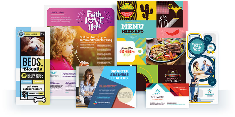
With every professional design series that StockLayouts produces there is always an identity built around the series that incorporates a business card as a part of a stationery set. We have over 400 unique business card templates to choose from in our design library and they are a great starting point for your next design project.
Finally, If you haven’t seen the cinematic gem that is the screen adaptation of the Bret Easton Ellis novel American Psycho, as quoted above, then I’d advise you to rent it, skip to the classic “business card scene” and watch it in all its unnerving glory. (or just youtube it.)